
Sunday, November 04, 2007
Puffin
I haven't used Corel Painter for a while, so I thought I'd get back to it. Here I painted a puffin using mostly wet acrylics and some smeary brushes as well. First, I cloned the image (file --> clone). In the clone I selected the image (Select --> All), and deleted it by pressing the backspace key. This left me with a blank canvas. I was able to toggle back and forth to the original image by turning the tracing paper effect on and off. I eyeballed most of the colors, but there were some that I selected using the color picker (hold alt key) while painting. None of the painting was done using the clone stamp. I really like the visible brush strokes and the appearance of layering paint in some areas.
Thursday, November 01, 2007
Halloween Jesus
A little backstory on Halloween Jesus.....A friend of mine was trying to explain the Trinity to another friend. When the part about the Holy Spirit/Holy Ghost came up, there was some questioning if that was when Jesus scares people on Halloween. It was suggested that I give life to Halloween Jesus, so here it goes. This is just the initial ink drawing. I definitely plan to draw him in Illustrator. I'd also like to draw some other Biblical figures in their Halloween best.....maybe Mummy Moses will be next :-)

Wednesday, October 24, 2007
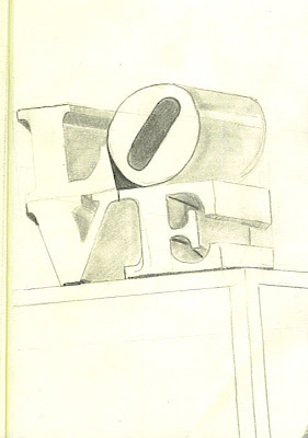
The Good
A few of the drawings from The Sketchbook Project that I think turned out really well (or better than expcected).


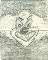
The Bad and The Ugly
As promised (or threatened), here are some of the very bad drawings I did for The Sketchbook Project. These are some quick sketches I did using charcoal. As previously stated, charcoal is NOT my friend. I've never worked with it before, and it is clear I need to practice. The point of the following sketches was to do something quick (1-2 minutes tops), with no reference material, using a medium I've never tried before. Since the theme of the project was "fear" I thought I did a good job of not only drawing things that represent fear, but doing it in a way that scared me.


Tuesday, October 23, 2007
Fun from The Sketchbook Project
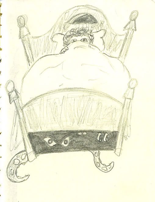
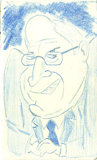
I haven't had time to work on anything new, so here are some more sketches that were part of The Sketchbook Project. All sketchbooks will be on dispay at the Art House in Decatur, Georgia on October 27th.
This is a quick cartoonish sketch I did of monsters hiding under a child's bed.
In keeping with the theme of "fear" I did 2 caricature's of people that scare a lot of us!

And to be fair, this probably scares those guys:
This is a quick cartoonish sketch I did of monsters hiding under a child's bed.
In keeping with the theme of "fear" I did 2 caricature's of people that scare a lot of us!


And to be fair, this probably scares those guys:

Monday, October 08, 2007
Busy
The past 6 weeks have been very busy....I got married and went on my honeymoon, so I did not have time to work on any drawings. Since then I have been busy with post wedding crap, car accidents, and everyday life. I just realized that the deadline for submitting my sketchbook to The Sketchbook Project was fast approaching, so I had to get to work.
The theme was "fears" so I decided to just do a literal interpretation and draw things that people are afraid of. I played around with different mediums (charcoal is NOT my friend) and styles. Some drawings I worked on for no longer than 1 minute, while others I worked on for hours. Some turned out really well, and some just did not. Seeing as the reason for this blog is to show my progression, I will be posting the good with the bad.
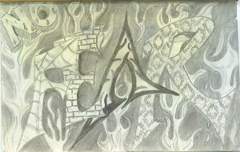
This is the 1st page of the book. Overall it's not the worst thing I did, but I did have a lot of trouble drawing flames. I used several different pencils from a B to 8B.
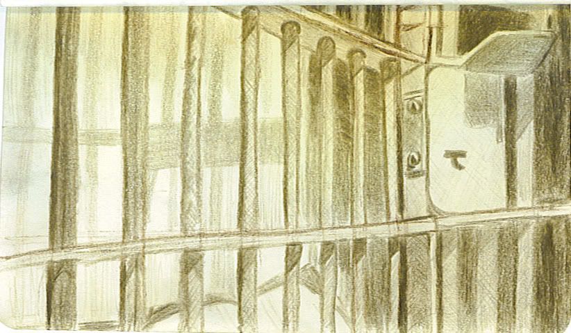
The next drawing of a jail cell was done using a single sepia pencil. I should have used a ruler to get the lines straight and keep the perspective.
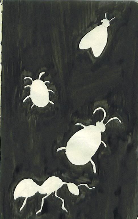
"Bugs" was done using black calligraphy ink and a crow quill pen. I haven't really worked with this medium before. I think it could have been a cool effect, but the paper was too thin to handle the ink and the pen was tearing right through the paper.
The theme was "fears" so I decided to just do a literal interpretation and draw things that people are afraid of. I played around with different mediums (charcoal is NOT my friend) and styles. Some drawings I worked on for no longer than 1 minute, while others I worked on for hours. Some turned out really well, and some just did not. Seeing as the reason for this blog is to show my progression, I will be posting the good with the bad.
This is the 1st page of the book. Overall it's not the worst thing I did, but I did have a lot of trouble drawing flames. I used several different pencils from a B to 8B.
The next drawing of a jail cell was done using a single sepia pencil. I should have used a ruler to get the lines straight and keep the perspective.
"Bugs" was done using black calligraphy ink and a crow quill pen. I haven't really worked with this medium before. I think it could have been a cool effect, but the paper was too thin to handle the ink and the pen was tearing right through the paper.
Thursday, August 23, 2007
progression
I am still incredibly new to Illustrator and Photoshop, so everytime I learn anything new, it makes a huge difference. Case in point is my profile pic. First I sketched the picture with pencil on tracing paper. 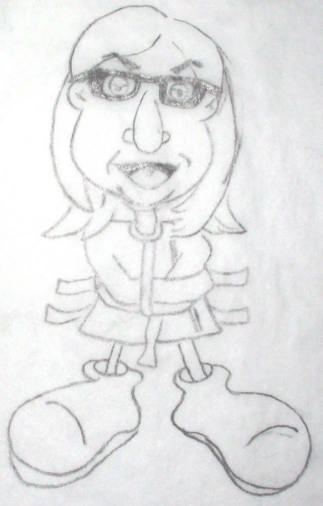
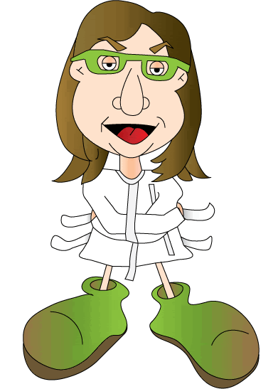
I learned a little bit about mesh gradients, which I incorporated into the shoes and hair. Also, some of the line work is a little better. Maybe in 6 months I'll take another stab at it to see how far I've come.
Edited to add: I didn't export very high quality images from Illustrator, so they are pixelated. The real images are much smoother. If I get around to it, I'll export them as PNG files and post again.
My 1st attempt at drawing the image in Illustrator:
I was playing with gradients a little, but my lines are horrible. I am NOT proficient with the pen tool. Hopefully practice really does make perfect.
My 2nd attempt in Illustrator:

I learned a little bit about mesh gradients, which I incorporated into the shoes and hair. Also, some of the line work is a little better. Maybe in 6 months I'll take another stab at it to see how far I've come.
Edited to add: I didn't export very high quality images from Illustrator, so they are pixelated. The real images are much smoother. If I get around to it, I'll export them as PNG files and post again.
Tuesday, August 07, 2007
Always tweaking....
I am always tweaking things I draw...always looking for ways to improve. Especially with anything I create digitally since I still have so much to learn.
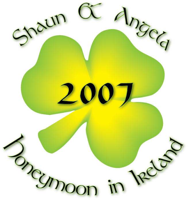
I added one small thing to the shamrock from the honeymoon t-shirt, but I think it really looks better. So I made a shape that follows the edge of one leaf, but a little smaller. I filled it with a greyscale gradient, and then set the transparency to "screen" mode.

I added one small thing to the shamrock from the honeymoon t-shirt, but I think it really looks better. So I made a shape that follows the edge of one leaf, but a little smaller. I filled it with a greyscale gradient, and then set the transparency to "screen" mode.
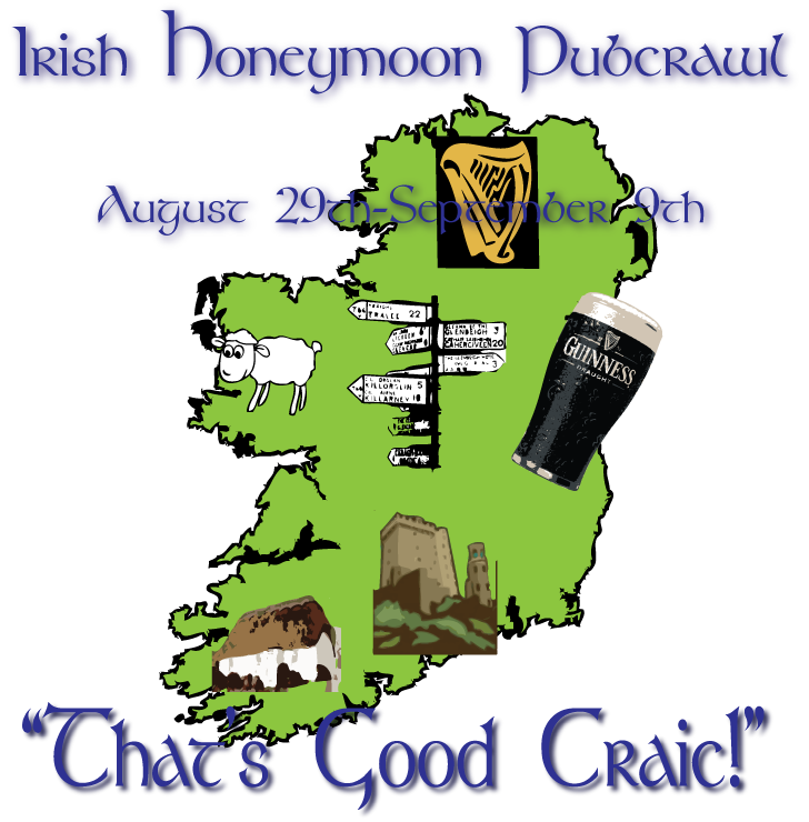
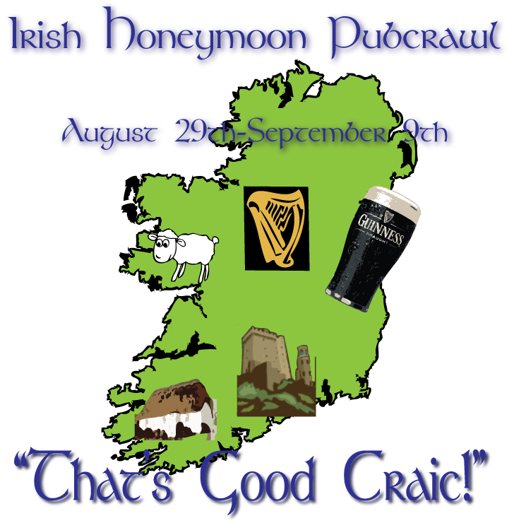
I also made a small change to the back of the shirt. I added a picture of a typical Ireland road sign and just moved some of the other images around. The road sign was made by using the live trace feature on an image from the internet. Again, a small change, but I think it really improves the overall look. Too bad I made these changes after the shirts have shipped.
Saturday, August 04, 2007
T-shirt I designed
Shaun and I are going to Ireland for our honeymoon, and we had this really silly idea to make t-shirts for the trip. He had heard of someone else doing something similar, and the bartenders and locals loved it.
I designed everything in Illustrator CS2. These designs really tested my limited knowledge of the program, and I think I used every technique I know, and may have even learned a think or two in the process. Most of the images were from the web, and then I used the "live trace" and/or "live paint" features. I created the shamrock using the "blend" tool. I saved both images as a PNG file, and uploaded them to CafePress to be printed.
Front of shirt (actual size around 4 inches, located at pocket area):
Back of shirt (centered):
Tuesday, July 31, 2007
The Sketchbook Project
Check out http://www.thesketchbookproject.com/. They will send you a sketchbook for $13 (part of the proceeds benefit a rape crisis center). You fill the sketchbook with anything you want relating to the theme (fears), and it will be put on display during an exhibit on October 27th. I think this is a really cool concept.
Hurry and register as there are only 85 books left!
Hurry and register as there are only 85 books left!
Saturday, July 21, 2007
Logo Design 2
I just thought I'd post with the latest change to the "sshabang" logo I am working on. I changed the tail a little on this one to better match my original sketch. I'm still waiting to hear back from my friend regarding any changes he may like. 
Monday, July 16, 2007
Logo Design
I have been working on my 1st freelance project which is a logo design. The logo is for a software program that works as an installer for OpenBSD (the program was tentatively called "sshabang"). A friend of mine is in charge of the software updates and was looking for a new logo. So I started coming up with some preliminary sketches that incorporated aspects of the OpenBSD blow fish. 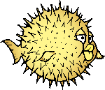 The OpenBSD blowfish logo is copyrighted by OpenBSD.
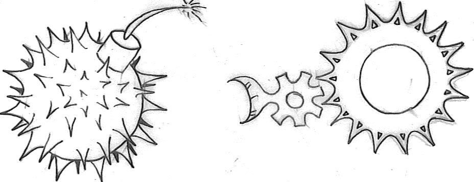
The OpenBSD blowfish logo is copyrighted by OpenBSD. The best 2 ideas were a bomb with spikes, and a series of cogs that morphed into the fish. I was thinking of "Spy vs. Spy" when I drew the bomb, and then added spikes to mimic the fish, and just make it look menacing. However, it was mistaken for a stick of dynamite in the fish's butt, so I guess I didn't convey the look I was going for.
 My friend preferred the cog logo, so I went to work in Illustrator and came up with 3 designs (all basically the same). The design is not finalized yet, and I think I need to work on some aspects (like the tail). Once I get some feedback I will be sure to post updates.


Sunday, July 15, 2007
About my blog
So the reason I am starting this blog is because my goal is to one day have a successful freelance art career. I have no formal art training, but I am hoping to go back to school soon. This blog is just a way for me to document the journey. It will be cool to see how I've progressed (especially with digital art...I'm trying to teach myself Illustrator & Photoshop now). Hopefully this will become a place where people can share tips and give constructive criticism.
Some old pencil drawings
A sketch of a convergent lady beetle I did: 
Sugar maple leaves drawn with carbon dust on drafting film. This was my first time working with drafting film and carbon dust. I quickly learned that fingerprints on film are a bad thing! However, it did end up creating some interesting texture effects. After completing this drawing, I ruined the whole thing by trying to backpaint it. 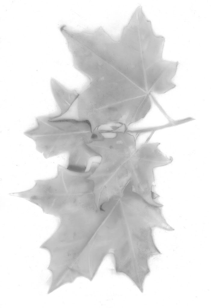
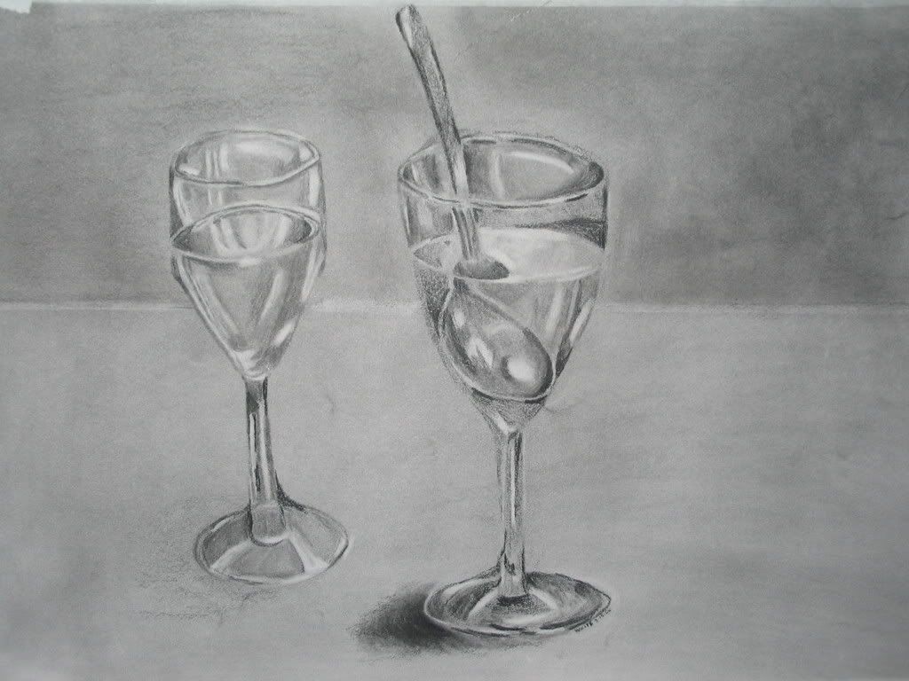
I took an adult continuing ed drawing class, and one night we had to draw a wine glass still life set-up. We covered the entire piece of paper with carbon dust, and then completed the drawing by adding darker values, or erasing to create lighter values.
I took an adult continuing ed drawing class, and one night we had to draw a wine glass still life set-up. We covered the entire piece of paper with carbon dust, and then completed the drawing by adding darker values, or erasing to create lighter values.
Some old digital drawings....
This was the 1st picture I ever did on the computer....I used Corel Painter (using the Pencil tool) and a Wacom tablet: 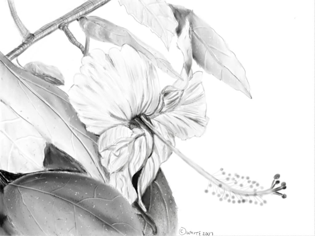
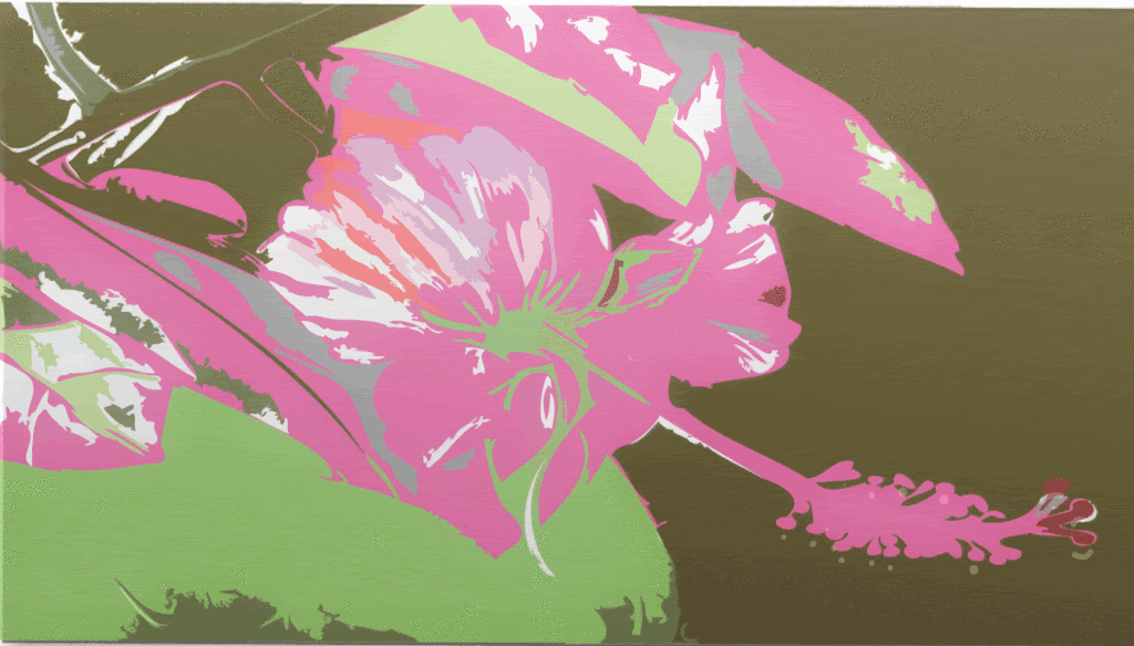
 When I bought Adobe Creative Suite 2, I was playing with the Live Trace and Live Paint features. The coloring is completely off, but I thought it looked cool anyway.
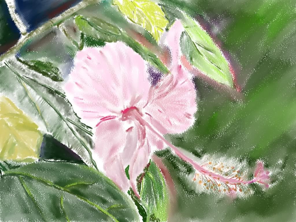
I then took the same picture and played with the oil pastel tool in Corel Painter:
When I bought Adobe Creative Suite 2, I was playing with the Live Trace and Live Paint features. The coloring is completely off, but I thought it looked cool anyway.
Subscribe to:
Posts (Atom)


