Monday, May 26, 2008

Elephants on parade


This is definitely the best piece so far! I had some small pieces of clayboard lying around, so I decided to use that. I also used more layers of thicker paint, and I let the ink dry overnight, which was probably the most important improvement.

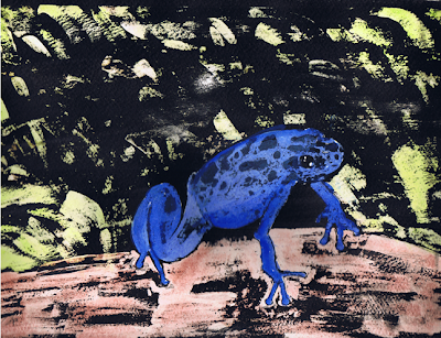
Gouache Fun


I had high hopes for this piece....the colors were great, and the ink was very black when I applied it. And then came the rinsing.....You never know what's going to happen when you rinse off the water, and I guess that is part of why people love gouache. What I did not expect was for all of my vibrant colors to completely wash off and for half of it to still be covered in ink. Hmmmm....why did this happen? Right now I think I just didn't wait long enough for the ink to dry. I figured 45 minutes or so was plenty of time, but it may not have been. Also, I think my layers of paint were too thin. I also had the same problem as the first piece with the paper ripping. I'm using professional grade 140lb cold press paper, so I wasn't sure what could be causing this. After it was semi-dry, I went back and added some color to the frog, but I don't like the way the ink spots now look washed out.

I have another idea to improve my technique, so we'll see what happens.

I'd like to add that this was not enhanced in Photoshop like the previous painting.

Sunday, May 25, 2008

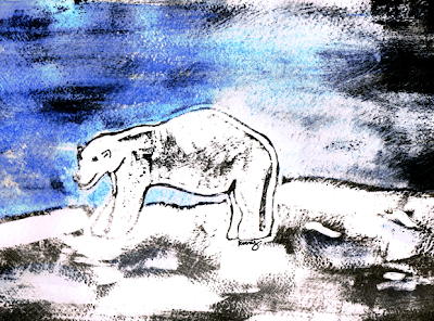
Don't resist


I just discovered the gouache resist technique and I fell in love with it! This is my first attempt. The only gouache I had was an old tube of white, so I decided to draw a polar bear. When rinsing off the ink, I rubbed too hard and ended up tearing the paper. The ink I used was also a little too watered down (I don't think I'll add any water to the next one). I adjusted the levels in Photoshop to make the black darker (it was more gray in the original). After the entire piece dried, I went back with some watercolors to add color to the sky and some shadows. I think I'm going to love this technique! I just bought a cheap gouache set, so stay tuned for more!

Thursday, May 22, 2008

Wednesday, May 21, 2008

Sunday, May 18, 2008

Kira: ink & colored pencil in my moleskine


My second attempt at ink drawings....better than the first, but I still have some issues with shading.

Saturday, May 17, 2008

Art DNA logo: Part 3


I wasn't completely happy with the way the logo turned out, so I decided to play with it some more. The biggest problem I had was that the pencil and brush were not intertwined, and therefore did not really resemble a DNA double helix. So I went back to my original Illustrator file, selected the brush & pencil, then used the pathfinder to divide the paths. Once that was done, I selected the paths I wanted to move and colored them accordingly. It's still not perfect, but it's getting better.

Sunday, May 11, 2008

Art in my DNA: The Sequel


I finished the logo that I started yesterday using Illustrator. The text was done using the scribble effect, and everything else was drawn with the pen tool.

Friday, May 09, 2008

Art is in my DNA


This is a preliminary sketch for my logo. Being the science dork that I am, I thought incorporating the DNA double helix into the logo would be cool. So I had the idea of using a pencil and paintbrush.

Thursday, May 01, 2008

A Scanner Darkly


This image was created using the tutorial here. It was painstaking work, and took the good part of a day, but I think it is worth it in the end.

Team Qualidation


Another logo idea...this is for my co-workers. I've recently learned a lot about making custom art brushes and transforming shapes. I like the retro look of it all.

more fun with the letter e