I wasn't completely happy with the way the logo turned out, so I decided to play with it some more. The biggest problem I had was that the pencil and brush were not intertwined, and therefore did not really resemble a DNA double helix. So I went back to my original Illustrator file, selected the brush & pencil, then used the pathfinder to divide the paths. Once that was done, I selected the paths I wanted to move and colored them accordingly. It's still not perfect, but it's getting better.
Showing posts with label logo. Show all posts
Showing posts with label logo. Show all posts
Saturday, May 17, 2008
Art DNA logo: Part 3
I wasn't completely happy with the way the logo turned out, so I decided to play with it some more. The biggest problem I had was that the pencil and brush were not intertwined, and therefore did not really resemble a DNA double helix. So I went back to my original Illustrator file, selected the brush & pencil, then used the pathfinder to divide the paths. Once that was done, I selected the paths I wanted to move and colored them accordingly. It's still not perfect, but it's getting better.
Sunday, May 11, 2008
Art in my DNA: The Sequel
I finished the logo that I started yesterday using Illustrator. The text was done using the scribble effect, and everything else was drawn with the pen tool.
Friday, May 09, 2008
Art is in my DNA

This is a preliminary sketch for my logo. Being the science dork that I am, I thought incorporating the DNA double helix into the logo would be cool. So I had the idea of using a pencil and paintbrush.
Thursday, May 01, 2008
Team Qualidation


Another logo idea...this is for my co-workers. I've recently learned a lot about making custom art brushes and transforming shapes. I like the retro look of it all.

Monday, February 11, 2008
Konite Designs


These are 2 logos I designed for my Cafepress shop (www.cafepress.com/konite). I made the starburst design by first drawing an elongated triangle and they using the transform feature to rotate it every 20 degrees. I placed a colored circle behind it, and then the cutout square in front (2nd picture). In the first pic, I made the cutout square white. I also gave a brushstroke to the text in the first image.
Wednesday, February 06, 2008
Hook, line, and sinker

There's a possibility I may be doing a logo for someone who is starting a fishing lure business. Since I heard about it I've been brainstorming some ideas. Here are just a couple preliminary sketches.
Thursday, January 10, 2008
Can't Stop!

I can't stop thinking of different ideas for my friend's website. There are so many things you can do with the letter "e." For this design, I drew a box, and then placed the letter on top. I subtracted the letter from the box (pathfinder menu), and added a shadow. I then copied the box 3 times and changed the orientation of each one. Viola!
Images are copyrighted and may not be used without my permission
Wednesday, January 09, 2008
Happy Accidents


While playing with some different logo design ideas I was moving the images around on the screen. The picture above happened when I copied the triangle with an E, and then pasted it on top. I was going to reflect the image, but I kinda liked the way it looked, so here it is.
Images are copyrighted and may not be used without my permission
Illustrator logo

This is just a very basic rendition of the sketch below in illustrator. I didn't do anything special. I used Live Paint to color the logo, then dropped a shadow.
Images are copyrighted and may not be used without my permission
More Logo Work

Images are copyrighted and may not be used without my permission
Thursday, January 03, 2008
button/pin logo
A friend mentioned needing a logo for a website he runs. He wanted something simple, perhaps just the letter "e." So I was playing around today with some simple pin shapes in Illustrator that I learned about on Veerle's blog (in my links). For Veerle's complete tutorial, go here:
Here are the 2 designs I've come up with based on the pin idea (the actual images are much nicer than the png files I've uploaded):


Images are copyrighted and may not be used without my permission
Here are the 2 designs I've come up with based on the pin idea (the actual images are much nicer than the png files I've uploaded):


Images are copyrighted and may not be used without my permission
Saturday, August 04, 2007
T-shirt I designed
Shaun and I are going to Ireland for our honeymoon, and we had this really silly idea to make t-shirts for the trip. He had heard of someone else doing something similar, and the bartenders and locals loved it.
I designed everything in Illustrator CS2. These designs really tested my limited knowledge of the program, and I think I used every technique I know, and may have even learned a think or two in the process. Most of the images were from the web, and then I used the "live trace" and/or "live paint" features. I created the shamrock using the "blend" tool. I saved both images as a PNG file, and uploaded them to CafePress to be printed.
Front of shirt (actual size around 4 inches, located at pocket area):
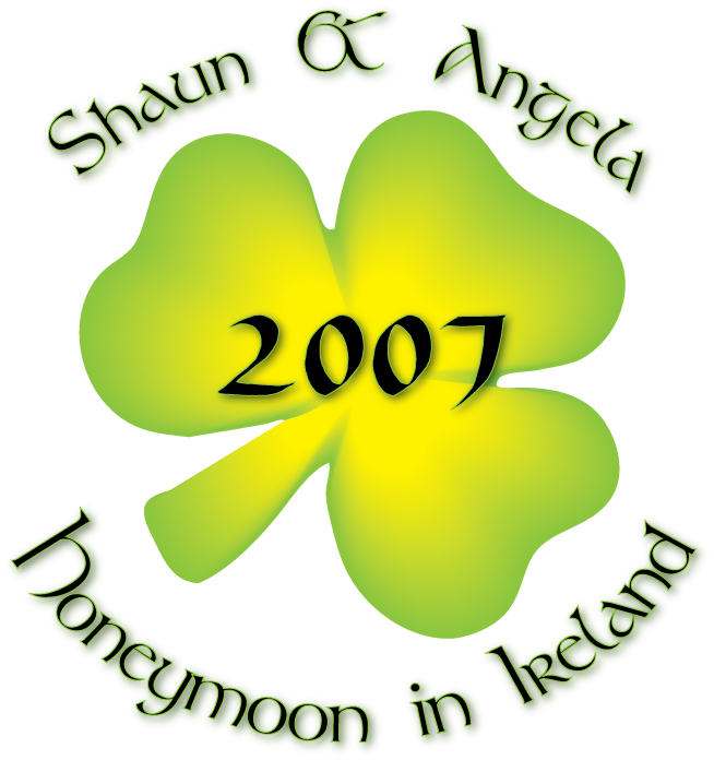
Back of shirt (centered):
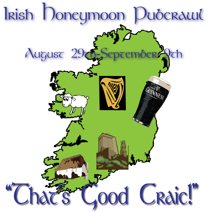
I designed everything in Illustrator CS2. These designs really tested my limited knowledge of the program, and I think I used every technique I know, and may have even learned a think or two in the process. Most of the images were from the web, and then I used the "live trace" and/or "live paint" features. I created the shamrock using the "blend" tool. I saved both images as a PNG file, and uploaded them to CafePress to be printed.
Front of shirt (actual size around 4 inches, located at pocket area):
Back of shirt (centered):
Saturday, July 21, 2007
Logo Design 2
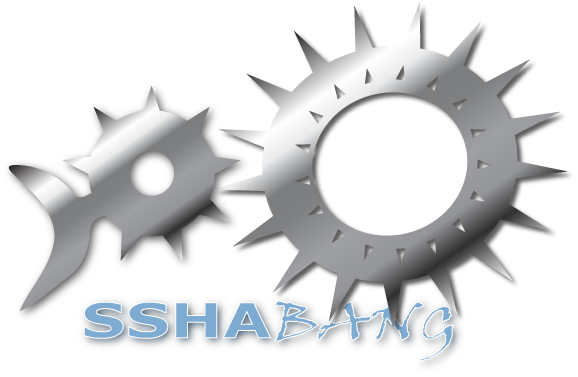
I just thought I'd post with the latest change to the "sshabang" logo I am working on. I changed the tail a little on this one to better match my original sketch. I'm still waiting to hear back from my friend regarding any changes he may like. 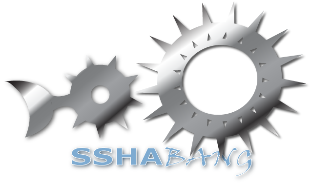
Monday, July 16, 2007
Logo Design
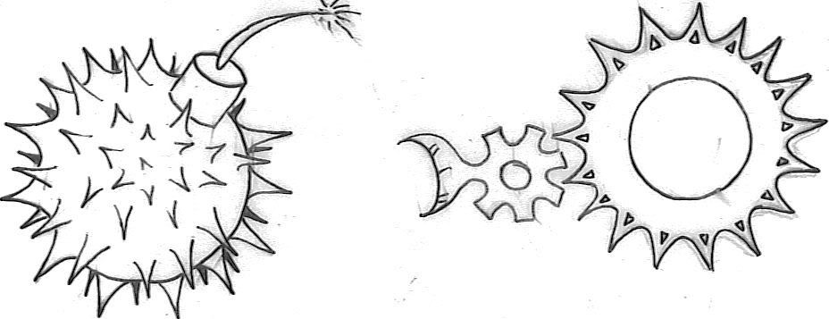
I have been working on my 1st freelance project which is a logo design. The logo is for a software program that works as an installer for OpenBSD (the program was tentatively called "sshabang"). A friend of mine is in charge of the software updates and was looking for a new logo. So I started coming up with some preliminary sketches that incorporated aspects of the OpenBSD blow fish. 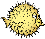 The OpenBSD blowfish logo is copyrighted by OpenBSD.
The OpenBSD blowfish logo is copyrighted by OpenBSD. The best 2 ideas were a bomb with spikes, and a series of cogs that morphed into the fish. I was thinking of "Spy vs. Spy" when I drew the bomb, and then added spikes to mimic the fish, and just make it look menacing. However, it was mistaken for a stick of dynamite in the fish's butt, so I guess I didn't convey the look I was going for.
 My friend preferred the cog logo, so I went to work in Illustrator and came up with 3 designs (all basically the same). The design is not finalized yet, and I think I need to work on some aspects (like the tail). Once I get some feedback I will be sure to post updates.
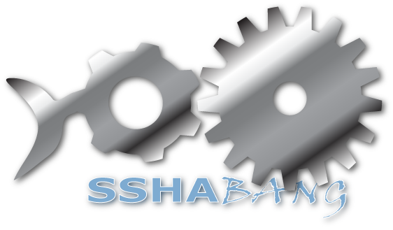

Subscribe to:
Posts (Atom)


